## Warning: package 'CVXR' was built under R version 4.3.3
North Carolina Polling Analysis: Historical Trends, Economic Impacts, and Key Events
This blog is part of an ongoing assignment for Gov 1347: Election Analytics, a course at Harvard College taught by Professor Ryan Enos. Throughout the semester, we will explore historical election data and use it to forecast the outcome of the 2024 election.
Introduction:
North Carolina has consistently been a pivotal battleground state in recent elections. Analyzing its voting patterns requires not only an understanding of historical polling data but also insight into how economic and political events shape public opinion. In this blog post, I’ll explore polling data from North Carolina between 2000 and 2024, with special attention to how factors like GDP growth, unemployment rates, and key political events influence polling trends. By visualizing these relationships, we aim to clarify the role that both historical trends and economic performance play in shaping voter preferences.
Let’s dive into the analysis.
Smoothed Polling Averages and Key Events in North Carolina (2020 and 2016):
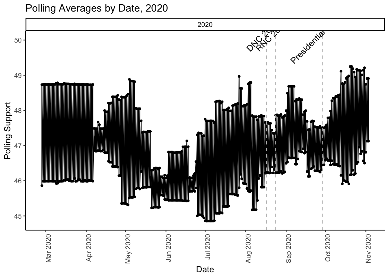
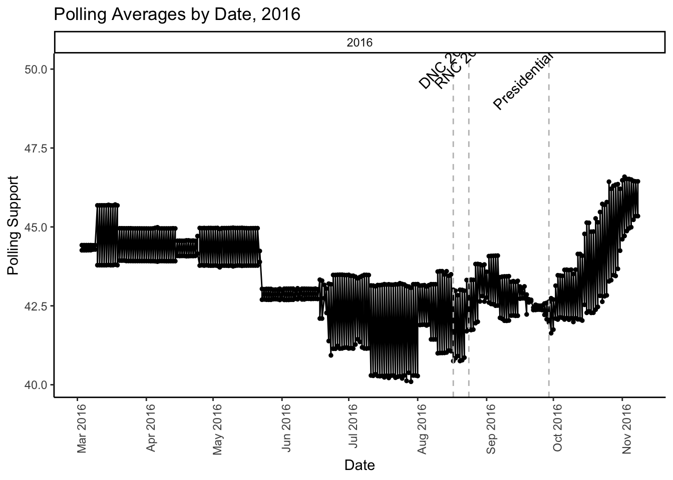
To give a clearer picture of overall polling trends and how significant events influence these trends, we’ve smoothed the polling data and marked key moments, such as national conventions and presidential debates, that could have impacted voter sentiment.
Smoothed polling refers to a technique used to eliminate short-term fluctuations or noise in polling data by averaging out the results over time. This helps to provide a clearer picture of overall trends, avoiding misleading conclusions from any individual poll that might be an outlier. For example, instead of focusing on the results of one poll conducted over a few days, smoothing might average the results of multiple polls conducted over weeks or months, giving more weight to the general direction of voter sentiment rather than sudden, temporary shifts.
This method is useful for identifying momentum shifts, especially after key events. By reducing the volatility of raw polling data, it allows for better decision-making by campaigns and analysts who track long-term trends, helping avoid overreactions to anomalies. In states like North Carolina, where polling margins can be tight, smoothed polling provides a clearer, more reliable forecast of potential outcomes by minimizing the impact of short-term poll fluctuations.

The graph depicts polling averages throughout the 2020 U.S. presidential election, with notable shifts driven by key events. Early in the year, the COVID-19 pandemic dramatically altered the political landscape, affecting both campaigns as they adjusted to new realities. The Black Lives Matter protests following George Floyd’s death in May also played a significant role in shaping public opinion, leading to visible changes in polling data.
Later, in August, both the Democratic and Republican National Conventions brought predictable bumps in polling for Joe Biden and Donald Trump, respectively. As the race continued, the presidential debates and Trump’s COVID-19 diagnosis in October further influenced voter sentiment. The graph concludes near Election Day in November, reflecting the final polling averages before Biden’s victory.
This clearly shows us that 2020 was a political landscape of injustice and times of uncertainty due to so many socially exhausting events. The graph explicitly tells us that whenever a social tragedy impacted the nation polling opinions were going up because it gave the people a voice. Yet this did not stop Trump from claiming that the polls were either rigged or fake, and that this would be a clear win for the then Republican incumbent.
nc_state_polling$poll_date <- as.Date(nc_state_polling$poll_date, format = "%Y-%m-%d")

nc_state_polling_filtered <- subset(nc_state_polling, format(poll_date, "%Y") %in% c("2016"))

events <- data.frame(
  event = c("DNC 2016", "RNC 2016", "Presidential Debate"),
  date = as.Date(c("2016-08-17", "2016-08-24", "2016-09-29"))
)

ggplot(nc_state_polling_filtered, aes(x = poll_date, y = poll_support)) +
  geom_point(size = 1) +
  geom_line() +
  geom_vline(data = events, aes(xintercept = as.numeric(date)), linetype = "dashed", color = "grey") +
  geom_text(data = events, aes(x = date, y = 50, label = event), angle = 45, vjust = -0.5) +
  scale_x_date(date_labels = "%b %Y", date_breaks = "1 month") +

  scale_color_manual(values = c("dodgerblue4", "firebrick")) +
  labs(x = "Date", y = "Polling Support", title = "Polling Averages by Date, 2016") +
  theme_classic() +
  theme(axis.text.x = element_text(angle = 90, hjust = 1)) +
  facet_wrap(~ year, scales = "free_x")

In 2016, the polling averages appear to be relatively stable for most of the year, with a slight but steady rise in support toward the general election. This was a more unpredictable year as the polling data did not fully anticipate the eventual outcome, with fluctuations after key events like the Democratic National Convention (DNC) and the presidential debates, but not showing a drastic shift until later in the cycle.
Therefore, it shows a certain phenomenon in which pre-election polls can suppress turnout. Hillary Clinton was clearly favored in the polls of 2016 but she still lost but was it due to Trump being a better candidate or for simply being a men? No, the average voter gets lazy when they see a forecast of polls every week on the news. They believe that the game is over because it has already been predicted.
North Carolina Polling vs. Quarterly GDP Growth (2000-2024):
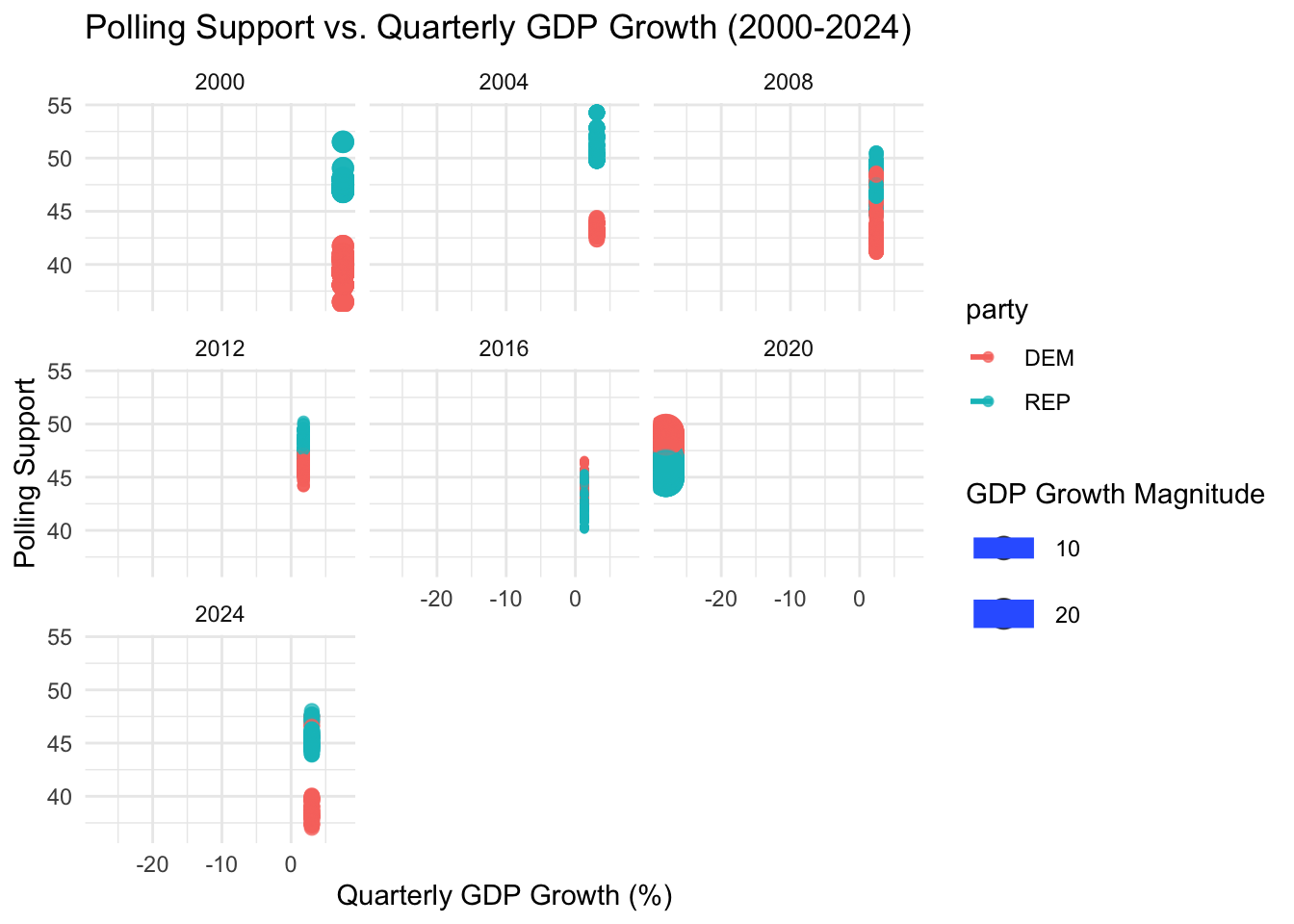
Next, I want to examine how economic conditions, specifically quarterly GDP growth, impact polling support. As many voters tend to believe that they purely vote due to the economy and usually it follows with that the Republican policy has a better impact on the economy. Using a simplified color-coded graph, I will highlight how GDP growth trends might have influenced voter preferences in recent election cycles.
## Warning: Using `size` aesthetic for lines was deprecated in ggplot2 3.4.0.
## ℹ Please use `linewidth` instead.
## This warning is displayed once every 8 hours.
## Call `lifecycle::last_lifecycle_warnings()` to see where this warning was
## generated.

This graph tells an interesting story about the relationship between the economy, measured by quarterly GDP growth, and polling support for both Democrats and Republicans during U.S. presidential election years from 2000 to 2024. On the x-axis, we see GDP growth percentages for the quarters leading up to each election, while the y-axis shows polling support for each party. The red points represent polling data for Democratic candidates, and the green points represent Republican candidates, with larger dots signaling stronger economic growth.
What stands out is the clear visual trend suggesting that during the years when Republicans held the presidency—particularly in 2004, 2008, and 2020—the economy was not performing as well, marked by lower or even negative GDP growth in some quarters. For instance, in 2008 during George W. Bush’s presidency, we see a steep dip in economic performance, coinciding with the financial crisis, and polling support for Republicans correspondingly weakened. The same pattern emerges in 2020, where under President Trump, the economy suffered from the effects of the COVID-19 pandemic, reflected by negative GDP growth and a sharp decline in Republican polling support.
Conversely, during years when Democratic presidents were in office, such as in 2012 and 2016 under President Obama, the economy showed more stable or positive growth, and polling support for the Democratic Party generally remained strong. This graph may indicate that Republican presidencies, at least in the time frame shown, align with periods of economic downturns or slower growth, which can significantly affect their polling outcomes in elections. As we look to 2024, the economic data could play a crucial role in shaping polling trends, just as it has in the past.
North Carolina Polling vs. Unemployment Rate (2000-2024):
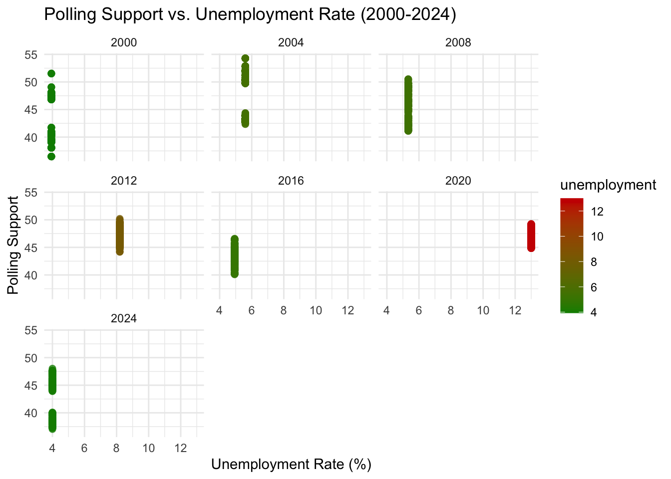
Finally, we explore how unemployment rates impact polling support, using a color gradient to show the severity of unemployment rates and their influence on voter preferences. Unemployment, permanently has the same issue with being perceived as “it’s only linked to the economy”. Here, voters have the tendency to reason with changing the incumbent when there is rise in unemployment, which is common believe but let’s see what the graph shows.

In this graph, I used a color gradient to represent the severity of unemployment. Green represents lower unemployment rates, while red represents higher rates. This visual cue makes it easier to spot years where unemployment may have significantly affected polling support.
For example, years with higher unemployment rates (in red) often show a negative impact on polling support for the incumbent party, reflecting voter dissatisfaction with economic conditions. This visualization helps us understand how economic hardship might drive voter preferences in upcoming elections.
In fact, we observe that the unemployment rate was better with a democratic party leader except for 2012 with Obama’s first presidency. However, he did win in the same year and the only time their was a change in party due to a high rate of unemployment was during Trump presidency in 2020, in which he lost the election. This graph clearly explains that voter behavior isn’t correlated to uneployment rate but more so with social events that move the country, one must consider we will always observe outliers within polling data from past election years.
Conclusion:
From the analysis of North Carolina’s historical polling trends and the relationships between economic indicators, such as GDP growth and unemployment, we can draw several important insights that may help forecast the 2024 election outcomes.
As we look to 2024, it will be important to consider not only economic indicators but also the potential for social events—such as movements for racial or social justice, environmental disasters, or geopolitical tensions—to influence the race. Voters increasingly respond to these non-economic factors, and candidates who can effectively navigate these issues may hold a decisive advantage.
In conclusion, while economic performance remains a key factor, the interplay of political events and voter perceptions will be critical in determining the final outcome. As the 2024 election unfolds, staying attuned to both economic conditions and the broader social and political climate will be essential for understanding voter behavior and accurately predicting election results.